
اهلا بكم احبائى الكرام.اقدم لكم في هذه التدوينة اضافة الخدمات المصغرة بعنوان احترافى وبتاثيرات احترافية للبلوجر بطريقة فلات انيقة وتكمن اهمية هذه الاضافة في ابراز شيئ ما او ايصال ملاحظة بالخدمات التى تقدمها او تنويه للزائر بخدماتك وتسويك خدماتك بشكل افضل وبناء على كثرة الطلبات عليها قررت تقديمها لكم لكى تستفيدوا جميعا .
شرح التركيب
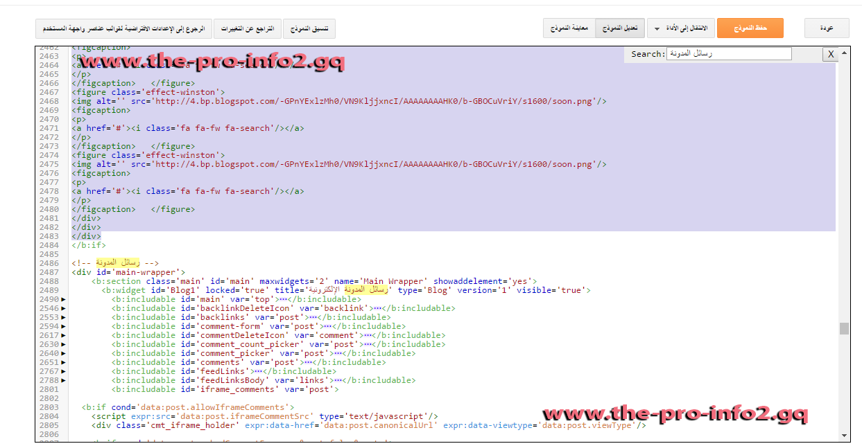
1. اذهب الي تحرير HTML
2. إبحث عن </head>
3. قم بوضع هذا الكود فوقه
<style>
.mahows-title h100{line-height: 30px;padding-top: 2px;padding-bottom: 8px;border-radius: 0;float: right;clear: both;padding-right: 10px;color: #fff;text-align: right;width: 98%;height: 42px;font-size: 20px;background: #254E71;font-weight: normal;margin: 5px;border: 3px solid #fff;margin-right: 0px;}
.mahows-title h100:hover{background-color:#F74047;text-decoration: none; transition: 1.0s; background: #29567D; background-image: linear-gradient(110deg, #F74047 0%, #F74047 50%, transparent 50%, transparent 100%); background-size: 200%; background-position: 150% 0; background-repeat: no-repeat; transition: background-position 1.9s ease, color 1.15s ease;}
.mahows-title h100:before{content: "\f115"; display: inline-block; font: 20px fontawesome;margin-left: 5px; padding-right: 0px;}
.mahows-title h100:hover:before{color: #ccc;}
.circle { float: left; height: 12px; width: 12px; margin: 10px 0 0 10px; border-radius: 50%!important; }
.circle:first-child { background:#ff5335; }
.circle:nth-child(2) { background: #ffba35; }
.circle:nth-child(3) { background:#71b63c; }
i.fa.fa-fw.fa-search {background-color: #424E5A;border-radius: 100px;padding: 3px 0px 3px 0px;color: #FFFFFF;}
i.fa.fa-fw.fa-comments-o {background-color: #0894D8;border-radius: 100px;padding: 3px 0px 3px 0px;color: #FFFFFF;}
h212 {display: block;text-align: center;margin: -51px -31px 0px 0px !important;width: 215px;background: rgba(0, 168, 171, 0.81);padding: 2px 4px 4px 4px;}
h212:before {font-family: fontawesome;content: '\f005\f005\f005';display: inline-block;position: absolute;color: #f39c12;text-align: center;bottom: 0;left: 0;margin: -54px 6px;font-size: 11px;padding: 0;font-weight: normal;line-height: normal;transition: all .3s;background-color: white;padding: 2px 4px 2px 4px;}
#BAimgEffect *, #BAimgEffect *:after, #BAimgEffect *:before { -webkit-box-sizing: border-box; box-sizing: border-box; }
#BAimgEffect a {outline: none;color: #3498db;text-decoration: none;}
#BAimgEffect a:hover, #BAimgEffect a:focus {color: #528cb3;}
.contentBAEffect { margin: 0 auto;}
.contentBAEffect > h212 {clear: both; margin: 0;padding: 4em 1% 0;color: #484B54;font-weight: 800;font-size: 1.5em;}
.contentBAEffect > h212:first-child { padding-top: 0em;}
.grid {position: relative;width: 685px;clear: both;margin: 0 auto;padding: 1em 0 4em;list-style: none;text-align: center;}
/* Common style */
.grid figure {position: relative;float: left;overflow: hidden;margin: -14px 0% 14px 0px;max-height: 306px;width: 23%;height: 121px;background: #3085a3;text-align: center;cursor: pointer;border: 3px solid #fff;}
.grid figure img {position: relative;display: block;min-height: 100%;max-width: 100%;opacity: 0.8;width: 100%;height: 100%;}
.grid figure figcaption {padding: 2em;color: #fff;text-transform: uppercase;font-size: 1.25em;-webkit-backface-visibility: hidden;backface-visibility: hidden;}
.grid figure figcaption::before,.grid figure figcaption::after {pointer-events: none;}
.grid figure figcaption,
.grid figure figcaption > a {position: absolute;top: 0;left: 0;width: 100%;height: 100%;}
/* Anchor will cover the whole item by default */
/* For some effects it will show as a button */
.grid figure figcaption > a {z-index: 1000;text-indent: 200%;white-space: nowrap;font-size: 0;opacity: 0;}
.grid figure h212 {word-spacing: 0em;font-weight: 300;}
.grid figure h212 span {font-weight: 800;}
.grid figure h212,.grid figure p {margin: 0;}
.grid figure p {letter-spacing: 1px;font-size: 68.5%;}
/* Individual effects */
/*-----------------*/
/***** Winston *****/
/*-----------------*/
figure.effect-winston {background: #162633;text-align: left;margin: -12px 0px 17px 4.4px;float: right;}
figure.effect-winston img {-webkit-transition: opacity 0.45s;transition: opacity 0.45s;-webkit-backface-visibility: hidden;backface-visibility: hidden;}
figure.effect-winston figcaption::before {position: absolute;top: 0;left: 0;width: 100%;height: 100%;background: url(https://googledrive.com/host/0B30379AIS0OdbDVxSDFKUU9Ib28/) no-repeat center center;background-size: 122% 120%;content: '';-webkit-transition: opacity 0.45s, -webkit-transform 0.45s;transition: opacity 0.45s, transform 0.45s;-webkit-transform: rotate3d(0,0,1,45deg);transform: rotate3d(0,0,1,45deg);-webkit-transform-origin: 0 100%;transform-origin: 0 100%;}
figure.effect-winston h212 {-webkit-transition: -webkit-transform 0.35s;transition: transform 0.35s;-webkit-transform: translate3d(0,20px,0);transform: translate3d(0,20px,0);}
figure.effect-winston p {position: absolute;right: -14px;bottom: -6px;padding: 0 1.5em 7% 0;}
figure.effect-winston a {margin: 0 0px;color: #5d504f;font-size: 170%;}
figure.effect-winston a:hover,figure.effect-winston a:focus {color: #cc6055;}
figure.effect-winston p a i {opacity: 0;-webkit-transition: opacity 0.35s, -webkit-transform 0.35s;transition: opacity 0.35s, transform 0.35s;-webkit-transform: translate3d(0,50px,0);transform: translate3d(0,50px,0);}
figure.effect-winston:hover img {opacity: 0.6;}
figure.effect-winston:hover h212 {}
figure.effect-winston:hover figcaption::before {opacity: 0.7;-webkit-transform: rotate3d(0,0,1,20deg);transform: rotate3d(0,0,1,20deg);}
figure.effect-winston:hover p i {opacity: 1;-webkit-transform: translate3d(0,0,0);transform: translate3d(0,0,0);}
figure.effect-winston:hover p a:nth-child(3) i {-webkit-transition-delay: 0.05s;transition-delay: 0.05s;}
figure.effect-winston:hover p a:nth-child(2) i {-webkit-transition-delay: 0.1s;transition-delay: 0.1s;}
figure.effect-winston:hover p a:first-child i {-webkit-transition-delay: 0.15s;transition-delay: 0.15s;}
</style>5. اذا لم تجده ابحث عن رسائل المدونة الالكترونية قم بوضع هذا الكود فوقه
6. اذا كنت تريدها فى الصفحة الرئيسية فقط اضع الكود التالى بين
<b:if cond='data:blog.url == data:blog.homepageUrl'>....</b:if>
7. او يمكن وضع هذا الكود فى اى مكان تريده اذا كانت لديك خبرة
<div id='BAimgEffect'>
<div class='contentBAEffect'>
<div class='mahows-title'>
<h100>
<div class='circle'/><div class='circle'/><div class='circle'/>
خدماتنا المجانية والمدفوعة
</h100>
</div>
<div class='grid'>
<figure class='effect-winston'>
<img alt='' src='hرابط الصورة'/>
<figcaption>
<p>
<a href='الرابط'><i class='fa fa-fw fa-search'/></a>
</p>
</figcaption> </figure>
<figure class='effect-winston'>
<img alt='' src='رابط الصورة'/>
<figcaption>
<p>
<a href='الرابط'><i class='fa fa-fw fa-search'/></a>
</p>
</figcaption> </figure>
<figure class='effect-winston'>
<img alt='' src='رابط الصورة'/>
<figcaption>
<p>
<a href='الرابط'><i class='fa fa-fw fa-search'/></a>
</p>
</figcaption> </figure>
<figure class='effect-winston'>
<img alt='' src='رابط الصورة'/>
<figcaption>
<p>
<a href='الرابط'><i class='fa fa-fw fa-search'/></a>
</p>
</figcaption> </figure>
</div>
</div>
</div>
اذا كانت هناك مشكلة او لم تجد اى شى من الوسوم فلا تتردد بطلب المساعدة عبر التعليقات او ركن الاسئلة والمشاكل
تعليقات
إرسال تعليق